Typography
Type specimens, pairings and posters. Faces shown at the size they were drawn for, doing a real job.
How this is done
Three faces, and each has a job
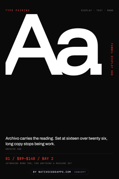
A type system needs a display face, a text face and a mono, and nothing more. Set the body first, because it is ninety percent of the words. The headline face is the easy part and it is chosen last.
- Set body copy at sixteen over twenty six and read a full paragraph. That is roughly where long text stops feeling like work.
- Hold the measure near sixty five characters. Longer lines lose the reader on the return.
- Pick the display face against the set body, never on its own. Faces are chosen in pairs.
- Reserve mono for values a person did not write. Prices, codes, times, identifiers.
- Print a page. Problems with spacing are far easier to see on paper than on a screen.
Try it
The same quarterly, four voices
One magazine, four type systems. Nothing moves but the faces and the space around them, and the whole publication changes character.
Reno, Nevada
A quarterly that is worth keeping
Long reporting, printed on paper that lasts, four times a year.
SubscribeOchre bowl$48
Sage vase$62
Serif, generous leading, a measure near sixty five characters. Built so a person can read four thousand words without noticing the type.
One neutral face at several weights. Modern, cheap to license, and it puts all the character in the layout instead.
One enormous face doing all the shouting, with the body set quietly underneath. Scale is the design, and it fails without real editing.
Everything on one width. Distinctive, slow to read in long passages, and worth it only when the subject is technical.
It depends
The same rule, four projects
None of the above survives contact with a real brief unchanged. Here is where the decision moves, and what moves it.
Long reading
Serif or a humanist sans, generous line height, and a measure that stays near sixty five.
A poster
One face doing everything, set enormous. Scale is the design.
A dense interface
A face with real small sizes and clear numerals. Test it at twelve pixels, not at forty.
Check the weights on paper. Ink spread makes a light face lighter than it looked on screen.
The set
The set
Elsewhere
If one of these is close
Working on something and unsure which way to take it? Tell us which of these you keep coming back to and we will work it up against your actual brief. Most projects start as somebody pointing at two directions and saying the truth is somewhere between them. That is a good way to start.
New pieces go up on the Typography board on Pinterest before they land here. The other sets sit on the design index, and what we build with all of it is what we do.