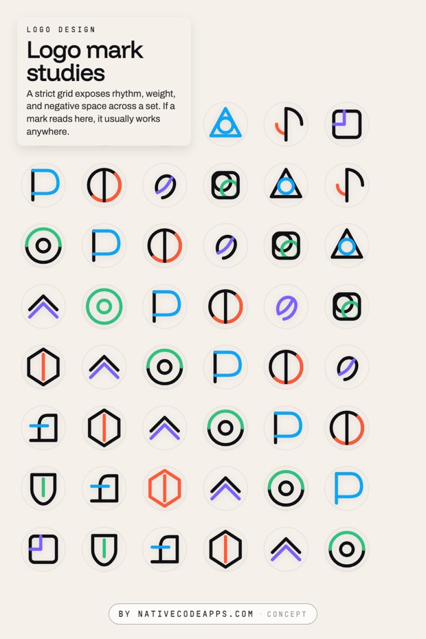
Logo design
A mark is not a drawing. It is a range, and the bottom of that range is where it gets decided.
The one thing
Draw thirty, judge them together
Marks are judged against each other, never one at a time. Put thirty on one grid at the same size and the weak ones become obvious in seconds. Present three in isolation and you are asking somebody to compare each one against an idea in their head.
The rejects are not waste. The pile is the argument for the one you chose, and it is the only evidence that the choice was a choice.
The descent
Twelve marks, shrinking
Here are twelve. At 200 pixels they all look resolved, and three of them look like the best of the set. Step the wall down and watch what happens to those three.
Presentation size. Everything looks resolved here, which is why the decision gets made further down.
A profile picture. The size where the silhouette starts doing most of the work.
A toolbar. Strokes above about two percent of the width are the ones still carrying the shape.
A tab. The silhouette is carrying it entirely, which is what makes a mark portable.
A favicon, and the smallest icon macOS ships. Whatever still reads here is the shortlist.
The three that step back below 24 pixels are the coil, the weave and the rosette. Every one of them is the most interesting thing on the wall at presentation size. That is the useful part. Detail is a fixed cost, so it buys the most where there is room for it.
Where 16 comes from
The floor is not arbitrary
Sixteen pixels is the smallest size an app icon is actually rendered at. Apple ships macOS icons at 16, 32, 128, 256 and 512, from a single 1024 pixel master. A browser favicon is 16 as well.
So the same artwork has to hold across a 64 to 1 range. Nothing else in a brand system is asked to do that. A wordmark gets to stay large. A color has no size at all. Only the mark is expected to survive being a sixty fourth of itself.
1024
The master, and the only place detail is free.
64
A tab, a list row, a search result. Silhouette only.
16
Favicon and the smallest system icon. The real test.
What holds up
Four things the survivors have in common
Strokes above five percent
A line at five percent of the mark's width still measures a full pixel at 16. That is what keeps it on the screen.
One idea, not two
A shape carrying one idea stays that idea at every size. Pick the one that has to come through and let it have the whole mark.
Counters that stay open
Keep every gap wider than the stroke around it. That is the ratio that keeps a counter reading as a hole all the way down.
A silhouette that means something
Fill the mark solid black. If it is still recognisable, the outline was doing the work rather than the detail.
Try it
The same bike shop, four identities
One workshop, four marks, and four different promises about what kind of place it is. The layout never changes.
Reno, Nevada
A bike shop that fixes anything
Same day tune ups, parts for frames nobody else stocks, and a workshop you can watch.
Book a serviceOchre bowl$48
Sage vase$62
Built to survive being pressed into metal. Solid shapes, no thin strokes, nothing that closes up under a die.
A signature rather than a symbol. Warmer, harder to reproduce small, and worth it for a shop where one person is the reason people come.
A badge, which reads as a club. Strong on a jersey, heavy on a favicon, and a commitment to being a team rather than a shop.
Two letters doing everything. Cheapest to apply, survives at sixteen pixels, and says nothing about bicycles at all.
It depends
The same rule, four applications
A mark stamped into clay
Solid shapes, no thin strokes. Anything under two millimeters disappears in the press.
An app icon
It lives at a rounded square in a grid of competitors. Test it beside them, not on a white page.
A law firm letterhead
It sits above serious words. Restraint reads as competence in a way that a clever mark does not.
Embroidery on a jacket
Every curve becomes a stitch. Simplify until the thread can follow it.
How this is done
Draw thirty, judge them together
- Work in one weight and one color first. Color hides problems that shape has not solved yet.
- Set every study on the same tile at the same size, so spacing is the only variable.
- Shrink the sheet until each mark is about sixteen pixels. Whatever is still readable is the shortlist.
- Test the two or three finalists where they will actually live. A favicon, a stamp, a shirt, a sign.
- Keep the rejects. The pile is the argument for the one you chose.
The set
Mark studies
Elsewhere
If one of these is close
Working on an identity and unsure which way to take it? Tell us which of these you keep coming back to and we will work it up against your actual brief. Most projects start as somebody pointing at two directions. That is a good way to start.
New studies go up on the Logo Design board before they land here. How we choose color is on the color page, and the rest sits on the design index.