Color palettes
Most palettes are a mood board with hex values under it. A palette you can build with is a list of jobs.
The one thing
Name every color by its job
A palette works when each color has one job and the name says what it is. Call them text, action, selected, confirmed and ground, and a screen builds itself. Call them blue one through blue five, and every single choice becomes an argument.
The test: hand the palette to somebody who has never seen the project. If they can build a screen without asking you a question, it is finished.
Why the number is the number
Where 4.5 to 1 comes from
Everybody quotes the threshold. Almost nobody quotes the reason, which is a shame, because the reason is what tells you when to go past it. The W3C derives it from visual acuity. A reader with 20/40 vision needs about 1.5 times the contrast of a reader with 20/20. Three times 1.5 is 4.5.
Two things follow from that. It is a threshold rather than a target. The same source is explicit that it is not rounded, so 4.499 to 1 does not pass.
The second thing matters more. It is derived from ordinary aging eyesight, not from a rare condition. So it covers far more of your audience than the word accessibility usually suggests.
4.5 to 1
Body text, and anything a person has to read rather than notice.
3 to 1
Large text, from about 24px, and the edges of controls.
One job at a time
Watch a palette assemble itself
Pick a palette, then step through the five jobs. Each color arrives with its measured contrast against the ground, and the interface underneath gains the piece that color was chosen for. Nothing is decorative here. A color exists because something on the screen needed it.
on ground
on ground
on ground
on ground
on ground
Cracked tooth, today
Two slots left this afternoon.
6:457:308:15
Book itConfirmed for 7:30. We sent it to your phone.
Why that order
Text first, ground last
The order is not arbitrary. Text is chosen first because everything else is measured against it, so picking it second means picking it twice. Ground comes last because by then you know what has to sit on it.
Two of the three palettes above put their action color between 4.72 and 5.09 against the ground. That is not a coincidence. It is what happens when you pick the most saturated version of a color that still clears the threshold.
Try it
The same shop, five palettes
Nothing below moves except the color and the shapes it implies. Same layout, same words, same structure, and five different companies come out of it.
Reno, Nevada
Made by one pair of hands
Small batch stoneware, thrown and fired in Reno. Everything ships within a week.
Shop the kilnOchre bowl$48
Sage vase$62
Square corners, flat fills, a heavy display face. Nothing competes with the words, which suits a maker selling on story rather than on price.
Round everything, lift it off the page, drop the contrast. Reads as friendly and low risk, which is what a first time buyer responds to.
Dark ground, one emitting color, tight spacing. Built for a phone in a dim room, which is where most browsing actually happens.
Deep ground, brass accent, letters spaced out rather than crammed. Slower to read on purpose, which is the point when the thing is expensive.
Thick black rules, one screaming accent, no softening anywhere. Impossible to ignore, and wrong for most people selling to a wide audience.
The part most palettes skip
What eight percent actually means
The usual line is that color blindness affects eight percent of men. That figure is only right for one population. Measured worldwide, red and green deficiency runs near eight percent in men of European descent. In men of Chinese and Japanese descent it runs between four and six and a half percent. In women it is under half a percent.
So here is Clinic, simulated. These are our own colors run through the standard transform, and the interesting part is not that they shift. It is which pair stops being a pair.
| Job | Normal | Deuteranopia | Protanopia | Tritanopia |
|---|---|---|---|---|
| Text | #0B1F2A | #151B2A | #1A1F2B | #002223 |
| Actions | #1B7A8C | #5E6B8C | #6D768D | #008180 |
| Selected | #8FD3D9 | #BCC3D9 | #C9CDDA | #73D8D5 |
| Confirmed | #F3B562 | #DAC664 | #CBB85A | #FFA5A2 |
| Ground | #F7F9F9 | #F8F8F9 | #F9F9F9 | #F6F9F9 |
Where our own palette gives out
Actions and Confirmed are the two colors carrying the most meaning on that screen. One says press this, the other says it worked. Measure the contrast between them once they are simulated and the gap closes:
Deuteranopia
3.09 to 1 between them
Protanopia
2.28 to 1 between them
Tritanopia
2.51 to 1 between them
Under protanopia those two fall to 2.28 to 1. That is not a palette to throw away. It is a palette that has told you something, which is that color alone cannot carry that difference. The fix is a second signal on the confirmation. A word, a check, or a position. Then the color is free to be color.
It depends
The same rule, four projects
A clinic booking app
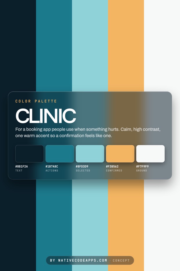
Low saturation, one warm accent, and it is spent on the confirmation. People open it when something hurts.
A late night music app
Dark ground and one emitting color. The screen is the only light in the room.
A tool used eight hours a day
Almost no color at all, held back for the one row that needs a person.
Anything that gets printed
Check the values in ink before falling in love. Bright screen colors go muddy on stock.
How this is done
Name every color by its job
- Start with the one thing a person has to notice, and pick that color first. Everything else is chosen against it.
- Give the accent exactly one job. A color used for three things stops meaning any of them.
- Check text on every background at real size. Anything under 4.5 to 1 is decoration, not text.
- Stop at five. A sixth color makes decisions slower without making screens better.
- Write the job beside the hex value. If the next person needs to ask, the palette is not finished.
The set
Palettes we have drawn
Elsewhere
If one of these is close
Working on something and unsure which way to take it? Tell us which of these you keep coming back to and we will work it up against your actual brief. Most projects start as somebody pointing at two directions and saying the truth is somewhere between them. That is a good way to start.
New palettes go up on the Color Palettes board before they land here. The other sets sit on the design index, and what we build with all of it is what we do.