App Design
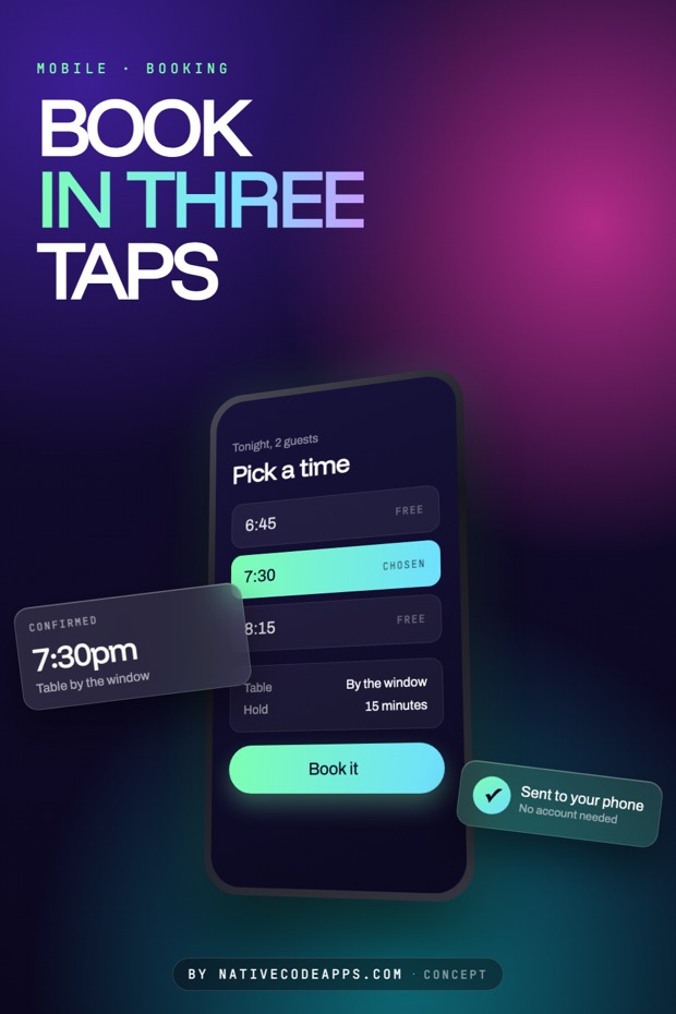
Mobile concepts shown as flows, not single screens. Booking, checkout, onboarding, and the small decisions that make a tap feel obvious.
How this is done
Count the taps, then remove one
A flow is measured in taps, not screens. Write down what somebody is trying to do, count what it currently costs them, then take one away. The tap you remove is usually a choice they did not need to make.
- Say the goal in one sentence. Book a table. Pay the bill. Reorder the usual.
- Lay every screen in the flow side by side. Problems in a flow are invisible one screen at a time.
- Look for choices with an obvious answer and make it the default instead.
- Put the thing being decided in reach of a thumb. The top of a phone is a two hand gesture.
- End on a screen that confirms what happened in the words the person used.
Try it
The same stop, four attitudes
One bus arrival, four ways of showing it. Watch what happens to the number when the assumption about the reader changes.
Reno, Nevada
The next bus, and nothing else
One screen, the stop you are standing at, and the time it actually arrives.
Find my stopOchre bowl$48
Sage vase$62
One number the size of a fist. Everything else demoted, because this is read while walking and holding a coffee.
Route colors carried through from the signage people already know. Cheap recognition, and it fails badly if the operator ever rebrands.
Grey on grey with one accent on the next arrival. Nothing shouts, which suits an app opened forty times a week.
Everything scaled for somebody who left their glasses at home. It costs density and it is the right default far more often than people build it.
It depends
The same rule, four projects
None of the above survives contact with a real brief unchanged. Here is where the decision moves, and what moves it.
Booking a table
Hold the slot before asking for an account. The account can wait, the table cannot.
Checkout
Every field is a reason to leave. Ask for what you need to ship, and nothing else.
Something opened daily
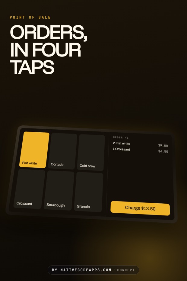
Put the repeat action first. The second most common thing people do is the same thing again.
A first run
Show the product with something already in it. An empty app teaches nothing.
The set
The set
Elsewhere
If one of these is close
Working on something and unsure which way to take it? Tell us which of these you keep coming back to and we will work it up against your actual brief. Most projects start as somebody pointing at two directions and saying the truth is somewhere between them. That is a good way to start.
New pieces go up on the App Design board on Pinterest before they land here. The other sets sit on the design index, and what we build with all of it is what we do.